
Statistics for Economics | ISC Class 11 Economics Notes
On this page
This note covers statistics and its limitations, collection and organisation of data, tables and graphs, arithmetic mean, median, mode, dispersion, correlation, index numbers, and the equation and slope of a straight line.
What is statistics, and why does economics need it?
Definition: Statistics deals with collecting, presenting, analysing and interpreting numerical data. Data are recorded facts or observations used to understand a problem.
Economics studies choices about scarce resources, production and distribution for consumption. Scarcity means resources are limited relative to wants.
What does statistical analysis contribute?
Quantitative data describe measurable quantities, such as income and prices. Qualitative data describe attributes, such as skills or health. Most economic data are quantitative, but economics also uses qualitative information collected and recorded systematically.
Statistics makes descriptions more precise, condenses large collections of observations, and helps examine relationships between economic factors. It can be used to test an assumed relationship and predict future trends. A policy is a measure intended to address a problem.
Data on unemployment and productivity help analyse poverty. Statistical evidence supports policy evaluation; consumption forecasts can guide production plans, and estimates of domestic production and demand inform imports.
What limitations must be remembered?
An average summarises a collection but does not describe every individual observation. A relationship between variables does not, by itself, establish that one causes the other. Conclusions depend on the quality of the information collected and the suitability of the method.
Note: Statistical methods are no substitute for common sense. Comparing a family's average height with a river's average depth does not establish that every family member can cross safely.
How are primary and secondary data collected?
Primary data are information collected first-hand for an enquiry. Secondary data have already been collected and processed by another agency. The same information is primary for its original collector and secondary for a later user.
Secondary sources include government reports, documents, newspapers, books and websites. The Census of India supplies population information. The National Sample Survey provides survey information on social and economic conditions. The Economic Survey is a source of economic tables and index numbers.
A survey gathers information from individuals. A respondent is the person supplying answers. A questionnaire contains the questions; an interview schedule can be administered by an investigator who asks questions and records responses.
| Collection method | Advantage | Limitation |
|---|---|---|
| Personal interview | Allows clarification and fuller answers through direct contact. | Requires more time and money; the interviewer's presence may influence answers. |
| Mailed questionnaire | Costs less and gives respondents time to consider their answers. | Offers less assistance and is likely to produce low response rates. |
| Telephone interview | Can be quicker and cheaper than personal interviews while allowing clarification. | Cannot reach people without access to a telephone. |
How is a useful questionnaire prepared?
- Keep the questionnaire short and use clear, precise language.
- Arrange questions from general matters to more specific matters.
- Avoid ambiguity, double negatives and leading wording that suggests an answer.
- Try the questionnaire on a small group and revise weaknesses before the main survey.
This trial is a pilot survey. It helps assess instructions, questions, investigators' performance, likely cost and required time. Closed-ended questions offer specified responses; open-ended questions allow respondents to answer in their own words.
How do census and sample surveys differ?
The population, or universe, is the complete collection of individuals or items to which a study refers. A census investigates every member. A sample is a selected part of the population from which information is obtained.
A representative sample reflects relevant characteristics of its population. It is generally smaller than the population and can provide reasonably accurate information at lower cost and in less time. Defining the population is therefore necessary before selecting the sample.
How does selection affect the evidence?
In random sampling, each individual has an equal chance of selection. Selection by drawing thoroughly mixed slips is one method. In non-random sampling, personal judgement or convenience affects selection, and every individual need not have an equal chance.
What kinds of errors can occur?
A parameter is a numerical characteristic of the population. A sample estimate approximates it. Sampling error is the difference between the estimate and the corresponding population value. Taking a larger sample can reduce its magnitude.
Non-sampling errors include exclusion caused by a biased selection plan, failure to obtain responses, incorrect measurement and recording mistakes. A census can also contain these errors. Increasing sample size does not readily remove them.
Worked example 1. Five farmers in Manipur have incomes recorded as 500, 550, 600, 650 and 700. A sample contains the observations 500 and 600. Compare their averages and find the gap.
Answer: The population average is 3000 ÷ 5 = 600. The sample average is 1100 ÷ 2 = 550. The gap is 600 − 550 = 50, so this sample underestimates the population average by 50.
How are variables organised into frequency distributions?
A variable is a characteristic that takes different values; an observation is one recorded value. A discrete variable takes distinct values, such as household size. A continuous variable can take intermediate values within a range, such as height or weight.
Raw data are observations before classification. Classification arranges them into groups. Chronological classification uses time, geographical classification uses location, qualitative classification uses attributes, and quantitative classification uses measurable characteristics.
What do frequency and class interval mean?
Frequency is the number of occurrences of a value or observations within a class. A frequency distribution lists values or classes alongside their frequencies. A class interval is a group bounded by lower and upper limits.
The class midpoint, also called the class mark, represents the class in grouped calculations. Its value is found from Class midpoint = (Lower limit + Upper limit) ÷ 2. The class width is the difference between its continuous upper and lower boundaries.
In the inclusive method, both stated limits belong to the class. In the exclusive method, one boundary is excluded. State the convention clearly: with the upper limit excluded, an observation of 40 belongs to 40 to 50, not 30 to 40.
How are discontinuous limits adjusted?
Income classes 800 to 899 and 900 to 999 have a gap of 1 between adjacent limits. Half this gap is 0.5. Subtract 0.5 from each lower limit and add 0.5 to each upper limit: 799.5 to 899.5 and 899.5 to 999.5.
Cumulative frequency is a running total of frequencies. Grouping makes data compact, but loses detail: the class frequency does not reveal every original value. A bivariate distribution records the frequencies of combinations of two variables.
How should tables, diagrams and graphs present data?
A statistical table places data in rows and columns. It needs a table number for identification, a clear title, row headings, column headings, the body of data and units. The source identifies where the data came from; notes explain qualifications that the headings cannot adequately convey.
A bar diagram compares categories through bar heights or lengths. Simple bars show one series; multiple bars compare related series; component bars divide totals into parts. Spaces separate ordinary bars, and their widths do not measure the values.
A pie diagram divides a circle into sectors representing parts of a total. Sector angle = (Component value ÷ Total value) × 360°, where ° means degrees. An arithmetic line graph plots time horizontally and the variable vertically, joining successive points to show movement over time.
How are frequency graphs different?
A histogram uses adjoining rectangles with class boundaries on the horizontal axis. Rectangle areas represent frequencies. With equal class widths, heights can represent frequencies directly. With unequal widths, use frequency density, meaning frequency divided by class width, for comparable heights.
What the figure shows
Daily wage histogram
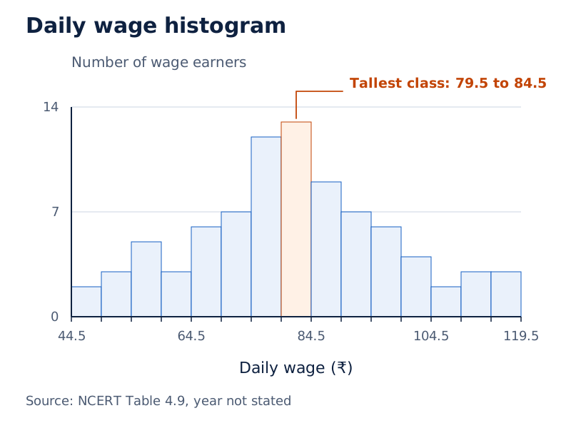
Daily wages in rupees appear horizontally and numbers of wage earners vertically. Adjacent shaded rectangles use continuous class boundaries. The tallest rectangle represents the wage class bounded by 79.5 and 84.5.
Drawn by One Young India.
A frequency polygon joins points plotted at class midpoints and corresponding frequencies. Its ends meet the baseline at the midpoints of additional zero-frequency classes. A frequency curve is a smooth curve passing as closely as possible through the polygon's points.
An ogive is a cumulative frequency curve. Plot less-than cumulative frequencies against upper class boundaries and more-than cumulative frequencies against lower boundaries. The former is never decreasing; the latter is never increasing.
What the figure shows
Intersecting ogives
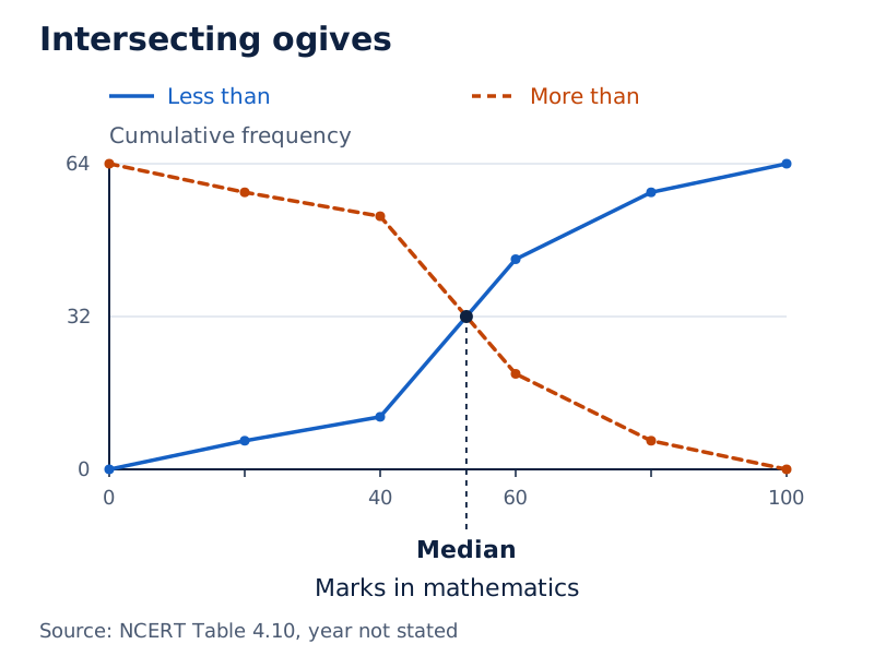
Marks in mathematics run horizontally and frequency vertically. The rising less-than ogive crosses the falling more-than ogive. A vertical guide from their intersection meets the marks axis at the median, the central positional value.
Drawn by One Young India.
How are simple and weighted arithmetic means calculated?
A measure of central tendency summarises a dataset through a representative value. The arithmetic mean adds all observations and divides by their number. It uses every observation, but unusually high or low values can pull it upwards or downwards.
Let x denote an observation, N the total number of observations, x̄ their arithmetic mean and Σ the instruction to add all relevant terms. Then x̄ = Σx ÷ N. For a frequency distribution, let f denote the frequency attached to each value.
The frequency formula is x̄ = Σfx ÷ Σf, with N = Σf. Here fx means frequency multiplied by the associated value. For continuous grouped data, use each class midpoint as x and retain the original class frequency.
Worked example 2. The marks of five students in an economics test are 40, 50, 55, 78 and 58. Calculate the arithmetic mean.
Answer: The total is 40 + 50 + 55 + 78 + 58 = 281. Divide by the five observations: x̄ = 281 ÷ 5 = 56.2 marks.
How do frequencies enter a mean?
Plots in a housing colony have the following sizes and frequencies. Here m² means square metres, the unit of area.
| Plot size, x (m²) | Number of plots, f | Product, fx (m²) |
|---|---|---|
| 100 | 200 | 20000 |
| 200 | 50 | 10000 |
| 300 | 10 | 3000 |
| Total | 260 | 33000 |
The mean is 33000 ÷ 260 = 126.92 m², rounded. Dividing by three would ignore the different numbers of plots.
What changes in a weighted mean?
A weight represents an item's importance. Let w be its weight and x̄w the weighted mean. Then x̄w = Σwx ÷ Σw. Expenditure shares can weight prices when commodities account for different parts of a consumer's budget.
For an assumed mean A, define deviation d = x − A. Then x̄ = A + Σfd ÷ Σf. If d′ = d ÷ c, where c is a common scaling factor, x̄ = A + (Σfd′ ÷ Σf) × c.
How are the median and quartiles located?
The median is the central positional value of ordered data. Arrange individual observations from smallest to largest. With an odd number of observations, select the middle item; with an even number, average the two middle values.
For odd N, the median occupies position (N + 1) ÷ 2. For even N, the middle positions are N ÷ 2 and N ÷ 2 + 1. These expressions identify positions, not the actual values at those positions.
Worked example 3. Find the median of 5, 7, 6, 1, 8, 10, 12, 4 and 3.
Answer: In ascending order, the observations are 1, 3, 4, 5, 6, 7, 8, 10 and 12. There are nine observations, so the fifth is central. The median is 6.
How is a grouped median calculated?
For a discrete frequency distribution, use cumulative frequencies to locate the middle observations. For continuous grouped data, identify the median class, containing position N ÷ 2. Let L be its lower boundary, C the cumulative frequency before it, f its frequency and h its width.
Median = L + [(N ÷ 2 − C) ÷ f] × h. Use the frequency of the median class, rather than its cumulative frequency, in the denominator.
The symbol ₹ means Indian rupees.
| Daily wage (₹) | Workers | Cumulative frequency |
|---|---|---|
| 20 to 25 | 14 | 14 |
| 25 to 30 | 28 | 42 |
| 30 to 35 | 33 | 75 |
| 35 to 40 | 30 | 105 |
| 40 to 45 | 20 | 125 |
| 45 to 50 | 15 | 140 |
| 50 to 55 | 13 | 153 |
| 55 to 60 | 7 | 160 |
Position 160 ÷ 2 = 80 lies in the wage class 35 to 40. Thus the median is 35 + [(80 − 75) ÷ 30] × 5 = ₹35.83, rounded to two decimal places.
What do quartiles show?
Quartiles divide ordered data into four parts. Q₁ is the lower quartile, Q₂ is the median and Q₃ is the upper quartile. The middle half of the observations lies between Q₁ and Q₃.
For an individual ordered series, locate Q₁ at (N + 1) ÷ 4 and Q₃ at 3(N + 1) ÷ 4. A fractional position is found by interpolation, meaning a proportional step between the neighbouring observations.
How is the mode related to the shape of a distribution?
The mode is the most frequently occurring value. In a discrete distribution, identify the largest frequency and then read its associated value. The frequency itself is not the mode. There may be one mode, multiple modes or no unique mode.
The observations 1, 2, 3, 4, 4 and 5 have mode 4. For a manufacturer considering shoe sizes, the mode identifies the most frequently demanded size. It differs from a mean or middle position.
How is grouped mode calculated?
The modal class has the largest frequency. For continuous, exclusive classes of equal width, let L be the modal class's lower boundary and h its width. Let f₁ be its frequency, f₀ the preceding frequency and f₂ the succeeding frequency.
Mode = L + [(f₁ − f₀) ÷ (2f₁ − f₀ − f₂)] × h. If a table supplies cumulative frequencies, first recover ordinary frequencies by subtracting successive cumulative totals. Do not choose a modal class by comparing cumulative totals.
In the daily-wage table above, the modal class is 30 to 35: its frequency is 33, compared with 28 before it and 30 after it. Mode = 30 + [(33 − 28) ÷ (66 − 28 − 30)] × 5 = ₹33.125.
How does skewness affect the averages?
Skewness means asymmetry in a distribution. In a symmetrical, single-peaked distribution, mean, median and mode coincide. With the usual single-peaked positively skewed shape, the longer tail lies towards higher values and the order is mode, median, mean.
With the usual single-peaked negatively skewed shape, the longer tail lies towards lower values and the order is mean, median, mode. These patterns are not universal rules for every dataset.
For moderately skewed distributions, the approximate relationship is Mode ≈ 3 × Median − 2 × Mean, where ≈ means approximately equal to.
What do range, quartile deviation and mean deviation measure?
Dispersion describes the spread or variability of observations. An average alone cannot reveal whether values cluster closely around it or are widely scattered. Measures of dispersion therefore supplement measures of central tendency.
Range = Maximum value − Minimum value. Range gives a rough indication of spread, but uses only the two extremes. It does not describe how the other observations are distributed around the average.
What does quartile deviation retain?
The interquartile range is Q₃ − Q₁. The quartile deviation is half this distance: Quartile deviation = (Q₃ − Q₁) ÷ 2. It describes the spread of the middle half of an ordered dataset.
For continuous grouped data, let L₁, C₁, f₁ and h₁ refer respectively to the lower boundary, preceding cumulative frequency, frequency and width of the lower-quartile class. Then Q₁ = L₁ + [(N ÷ 4 − C₁) ÷ f₁] × h₁.
For Q₃, use position 3N ÷ 4 and the corresponding quantities for the upper-quartile class. Locate each class using cumulative frequencies before substituting. Quartile deviation does not use the exact sizes of the lowest and highest quarters of observations.
For ordered marks 11, 12, 14, 18, 22, 26, 30, 32, 35 and 41, Q₁ occupies position 2.75 and equals 13.5. Q₃ occupies position 8.25 and equals 32.75. Quartile deviation is (32.75 − 13.5) ÷ 2 = 9.625 marks.
Why does mean deviation use absolute values?
Mean deviation is the average of absolute deviations from a specified central value. An absolute value, written between vertical bars, gives magnitude without a negative sign. If a denotes the chosen mean or median, then Mean deviation about a = Σ|x − a| ÷ N.
For frequencies, use Σf|x − a| ÷ Σf. For continuous classes, x represents the class midpoint. Absolute values prevent positive and negative deviations from cancelling.
Worked example 4. Calculate mean deviation about the mean for 6, 7, 10, 12, 13, 4, 8 and 12.
Answer: The mean is 72 ÷ 8 = 9. Absolute deviations are 3, 2, 1, 3, 4, 5, 1 and 3. Their sum is 22, giving mean deviation 22 ÷ 8 = 2.75.
How do standard deviation and coefficient of variation compare spread?
Variance is the mean of squared deviations from the arithmetic mean. Squaring prevents negative and positive deviations from cancelling. Standard deviation is the non-negative square root of variance and expresses spread in the original measurement unit.
Let σ² denote variance and σ, read as sigma, denote standard deviation. The notation x² means x multiplied by itself, while √ means square root. For ungrouped observations, σ² = Σ(x − x̄)² ÷ N and σ = √[Σ(x − x̄)² ÷ N].
With frequencies, σ = √[Σf(x − x̄)² ÷ Σf]. A computational alternative is σ = √[(Σfx² ÷ Σf) − x̄²]. Continuous grouped calculations use class midpoints with their frequencies.
How is the calculation organised?
- Calculate the arithmetic mean using all observations or their frequencies.
- Subtract the mean from each observation or class midpoint.
- Square each deviation and multiply by frequency where appropriate.
- Divide the total by the number of observations and take the square root.
Worked example 5. Find variance and standard deviation for 6, 8, 10, 12, 14, 16, 18, 20, 22 and 24.
Answer: The mean is 15. Squared deviations are 81, 49, 25, 9, 1, 1, 9, 25, 49 and 81, totalling 330. Variance is 330 ÷ 10 = 33. Standard deviation is √33 = 5.74, rounded to two decimal places.
What is relative variation?
The coefficient of variation, abbreviated CV, expresses standard deviation relative to a positive mean: CV = (σ ÷ x̄) × 100. It is a percentage and has no measurement unit. Lower CV indicates less relative variation and greater consistency.
For the preceding data, CV = (√33 ÷ 15) × 100, approximately 38.30%, where % means per hundred. Use the unrounded standard deviation when calculating it. Standard deviation measures absolute spread; CV helps compare spread relative to the size of the mean.
What does correlation reveal about two variables?
Correlation measures the direction and intensity of association between variables. Positive correlation means they move in the same direction; negative correlation means they move in opposite directions. Linear correlation concerns a relationship represented by a straight line.
A scatter diagram plots paired observations as separate points. Let X and Y denote the two variables, with X on the horizontal axis and Y on the vertical axis. Inspecting the point pattern helps identify direction, closeness and possible curvature.
What the figure shows
Patterns of correlation
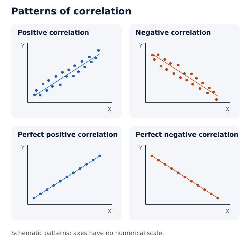
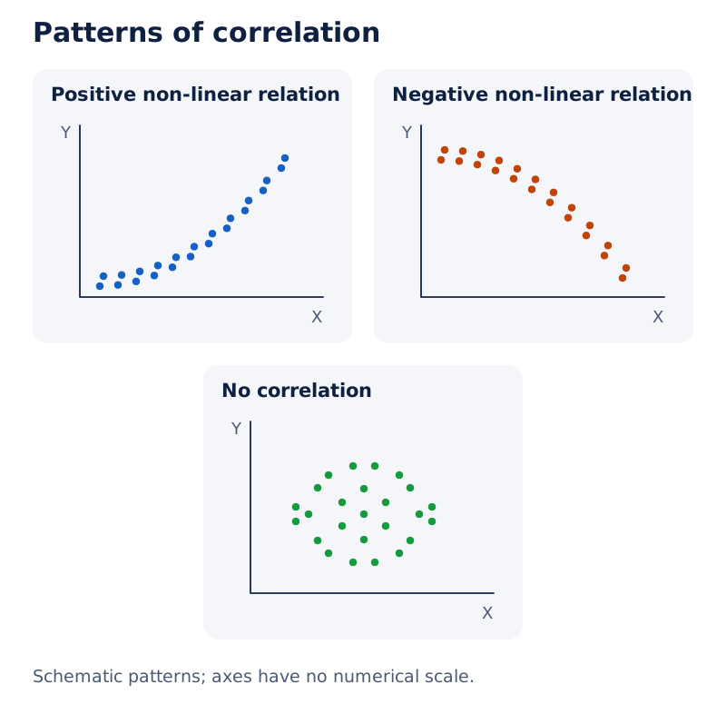
Points cluster around rising and falling lines in the positive and negative examples. The perfect examples place points directly on straight lines. Other panels show an undirected cloud and rising or falling curved patterns.
Drawn by One Young India.
How is Pearson's coefficient calculated?
Karl Pearson's coefficient, denoted r, measures linear association. Let X̄ and Ȳ be the means of X and Y, and let u = X − X̄ and v = Y − Ȳ be their deviations. Then r = Σuv ÷ √(Σu² × Σv²), provided both variables vary.
The coefficient has no unit and lies from −1 to +1. Values near either endpoint show strong linear association; values near zero show weak linear association. A value of zero does not rule out a non-linear relationship.
Worked example 6. Farmers' years of schooling are 0, 2, 4, 6, 8, 10 and 12. Corresponding annual yields per acre, valued in thousand rupees, are 4, 4, 6, 10, 10, 8 and 7. Find Pearson's coefficient.
Answer: X̄ = 6 and Ȳ = 7. The deviation totals are Σu² = 112, Σv² = 38 and Σuv = 42. Thus r = 42 ÷ √(112 × 38) = 0.644, showing positive linear association.
Correlation does not establish causation. A third factor may affect both variables. Rising temperature can accompany increased ice-cream sales and more swimming; eating ice cream does not therefore cause drowning.
When is Spearman's rank correlation useful?
A rank is an item's position after observations are ordered. Spearman's rank correlation measures association between the ranks of paired observations. It is useful when measurements are unavailable but items can be ranked, or when attributes are assessed in order.
How are distinct ranks compared?
Let rₛ denote Spearman's coefficient, n the number of paired items, and D the difference between each item's two ranks. With distinct ranks, rₛ = 1 − [6ΣD² ÷ (n³ − n)]. Here n³ means n multiplied by itself three times.
Worked example 7. Two judges rank five competitors in the same order of listing. Judge A gives ranks 1, 2, 3, 4, 5; judge B gives 2, 4, 1, 5, 3. Calculate their rank correlation.
Answer: Rank differences are −1, −2, 2, −1 and 2. Their squares total 14. Therefore rₛ = 1 − [6 × 14 ÷ (125 − 5)] = 0.3. The rankings have positive but weak association.
How are repeated ranks handled?
A tie occurs when equal observations occupy successive ranking positions. Give each tied item the average of those positions. The following item receives the next unused position. Equal values should not be given arbitrarily different ranks.
The school correction method adds a tie correction of (t³ − t) ÷ 12 to ΣD² for each tied group, where t is the number of items in that group. Include groups in either series before applying the corrected rank-difference formula.
For an exact rank correlation with ties, Pearson's formula can instead be applied to the averaged ranks themselves. Both coefficients describe association; neither supplies proof that one variable causes changes in the other.
How are index numbers constructed and interpreted?
An index number summarises relative change in related variables. The base period is the comparison period and conventionally has index 100. A price index measures price change; a quantity index measures change in physical volume.
Let p₀ and p₁ be base-period and current-period prices, and q₀ and q₁ the corresponding quantities. The subscripts 0 and 1 identify the two periods. A price relative is (p₁ ÷ p₀) × 100.
The simple aggregative price index is (Σp₁ ÷ Σp₀) × 100. A simple average of price relatives adds the individual relatives and divides by the number of commodities. Weighted indices recognise differences in importance.
How do the weighted formulas differ?
Let Pᴸ, Pᴾ and Pᶠ denote the Laspeyres, Paasche and Fisher price indices respectively. Pᴸ = (Σp₁q₀ ÷ Σp₀q₀) × 100 uses base quantities; Pᴾ = (Σp₁q₁ ÷ Σp₀q₁) × 100 uses current quantities.
Pᶠ = √(Pᴸ × Pᴾ). Fisher's index is the geometric mean, meaning the square root of the product, of these two positive indices. These weighted aggregative price indices use quantities as weights; corresponding weighted aggregative quantity indices use prices as weights.
| Commodity | Base price (₹) | Base quantity | Current price (₹) | Current quantity |
|---|---|---|---|---|
| A | 2 | 10 | 4 | 5 |
| B | 5 | 12 | 6 | 10 |
| C | 4 | 20 | 5 | 15 |
| D | 2 | 15 | 3 | 10 |
Worked example 8. Use the commodity table to calculate the three weighted price indices.
Answer: Σp₁q₀ = 257, Σp₀q₀ = 190, Σp₁q₁ = 185 and Σp₀q₁ = 140. Laspeyres is 135.3 and Paasche is 132.1, each rounded to one decimal place. Using their unrounded values, Fisher's index is approximately 133.69.
What affects an index's usefulness?
Select a clear purpose, representative commodities, a normal and reasonably recent base period, reliable prices and a suitable formula. Different baskets and weights can produce different results. An index of 250 means two-and-a-half times the base level, not an increase of 250%.
The Consumer Price Index (CPI) measures consumer price changes and helps assess living costs and real wages. The Wholesale Price Index (WPI) measures wholesale goods prices. The Index of Industrial Production (IIP) measures changes in industrial output quantities.
Real wage means a money wage expressed in purchasing power at base-period prices. With CPI based on 100, real wage = (money wage ÷ CPI) × 100. These indices support wage discussions, price analysis and economic policy.
How do straight-line equations describe relationships?
A straight-line equation specifies which pairs of values lie on a line. Let x and y now denote horizontal and vertical coordinates, meaning a point's positions relative to the two axes. The slope measures vertical change divided by horizontal change.
For points (x₁, y₁) and (x₂, y₂), let m denote slope. Then m = (y₂ − y₁) ÷ (x₂ − x₁), provided x₂ differs from x₁. Subscripts identify the first and second points.
A line rising from left to right has positive slope, while a falling line has negative slope. A horizontal line has zero slope. A vertical line has undefined slope because the change in the horizontal coordinate is zero.
What does the slope-intercept form mean?
y = mx + c, where c is the vertical intercept, the value of y when x is zero. Here c is an intercept, not the common scaling factor used earlier. The slope m remains constant along the line.
Through the point (−2, 3), the horizontal line is y = 3 and the vertical line is x = −2. Each equation fixes one coordinate.
Glossary
- Statistics — Methods of collecting, presenting, analysing and interpreting numerical information to understand the characteristics of data.
- Primary data — Information collected first-hand by an investigator for the purpose of a particular enquiry.
- Secondary data — Information previously collected and processed by another agency and subsequently used in an enquiry.
- Population — The complete collection of individuals or items to which a statistical investigation refers.
- Frequency — The number of occurrences of a value or observations falling within a specified class.
- Cumulative frequency — A running total obtained by adding frequencies up to a specified class or boundary.
- Arithmetic mean — The sum of all observed values divided by the total number of observations.
- Median — The middle positional value of ordered observations, averaging the two central values when necessary.
- Mode — The value occurring most frequently in a dataset, rather than the frequency of that value.
- Dispersion — The extent to which observations are spread out rather than concentrated around a central value.
- Standard deviation — The non-negative square root of the mean of squared deviations from the arithmetic mean.
- Coefficient of variation — Standard deviation expressed as a percentage of a positive mean to compare relative variability.
- Correlation — The direction and intensity of association between variables, which does not itself establish causation.
- Index number — A statistical measure summarising relative change in related variables against a specified comparison period.
- Slope — The ratio of vertical change to horizontal change between points on a non-vertical line.
Common errors and misconceptions
- Misconception: A large sample removes every error. Correct: Sampling error can be reduced, but biased coverage, non-response and incorrect recording can persist.
- Misconception: Histogram heights always represent frequency. Correct: Areas represent frequency; unequal widths require heights based on frequency density.
- Misconception: The median position is the median value. Correct: A position identifies where to look in ordered data; the corresponding observation supplies the value.
- Misconception: Signed deviations from the mean measure spread. Correct: Their sum is zero; mean deviation uses absolute values and variance uses squares.
- Misconception: Zero Pearson correlation means no relationship of any kind. Correct: It means no linear association; a non-linear relationship may remain.
- Misconception: A positive correlation proves a cause-and-effect connection. Correct: Common influences or coincidence may produce association without direct causation.
- Misconception: An index of 250 means prices increased by 250%. Correct: Relative to base 100, the increase is 150%, and the level is two-and-a-half times the base.
- Misconception: A vertical line has zero slope. Correct: A horizontal line has zero slope; a vertical line's slope is undefined.
Exam-style questions with model answers
Q1. Distinguish primary data from secondary data in two points. [2 marks]
- Primary data are collected first-hand for the enquiry; secondary data have already been collected and processed by another agency.
- Collecting primary data requires a fresh enquiry; using suitable secondary data saves the time and cost of collecting the information again.
Q2. Plot sizes in a housing colony are 100, 200 and 300 square metres, with 200, 50 and 10 plots respectively. Calculate the mean plot size and explain why dividing by three is incorrect. [4 marks]
- The total number of observations is the number of plots: 200 + 50 + 10 = 260.
- Multiply each size by its frequency: the products are 20000, 10000 and 3000 square metres.
- Add these products and divide by total frequency: mean = 33000 ÷ 260 = 126.92 square metres.
- Three counts the distinct sizes, not the plots. Dividing by three would ignore how frequently each size occurs.
Q3. Daily wage classes in rupees are 20 to 25, 25 to 30, 30 to 35, 35 to 40, 40 to 45, 45 to 50, 50 to 55 and 55 to 60. Their worker frequencies are respectively 14, 28, 33, 30, 20, 15, 13 and 7. Calculate the grouped median and interpret it. [5 marks]
- Add the frequencies to obtain 160 workers. The median position for this continuous grouped distribution is half the total, which is the 80th item.
- The cumulative frequencies are 14, 42, 75, 105, 125, 140, 153 and 160. The 80th item lies in the wage class 35 to 40.
- The required lower boundary is 35, preceding cumulative frequency is 75, class frequency is 30 and class width is 5.
- Substitute into the grouped median formula: 35 + [(80 − 75) ÷ 30] × 5 = ₹35.83, rounded to two decimal places.
- This estimates the central daily wage: half the workers fall at or below it and half at or above it.
Q4. Calculate the variance and standard deviation of 6, 8, 10, 12, 14, 16, 18, 20, 22 and 24. Explain the difference between these two measures. [5 marks]
- The ten observations total 150. Their arithmetic mean is therefore 150 divided by 10, giving a central value of 15.
- Subtract 15 from each observation. The deviations are −9, −7, −5, −3, −1, 1, 3, 5, 7 and 9.
- Square the deviations to obtain 81, 49, 25, 9, 1, 1, 9, 25, 49 and 81. Their sum is 330.
- Variance is the mean squared deviation: 330 ÷ 10 = 33. Standard deviation is its square root, √33, approximately 5.74.
- Variance expresses spread in squared units. Taking its square root gives standard deviation in the original observation unit, making its scale directly comparable with the data.
Q5. Farmers' schooling years are 0, 2, 4, 6, 8, 10 and 12. Their corresponding annual yields per acre, valued in thousand rupees, are 4, 4, 6, 10, 10, 8 and 7. Calculate Pearson's correlation and state one interpretive caution. [4 marks]
- The schooling values total 42 and the yield values total 49. Dividing each by seven gives means of 6 and 7 respectively.
- Subtract the respective means. Squared schooling deviations total 112, squared yield deviations total 38, and paired deviation products total 42.
- Pearson's coefficient is 42 ÷ √(112 × 38), giving approximately 0.644 and indicating positive linear association.
- This association does not by itself prove that additional schooling caused the observed differences in yield.
Q6. For five competitors listed in the same order, judge A assigns ranks 1, 2, 3, 4, 5 and judge B assigns ranks 2, 4, 1, 5, 3. Calculate Spearman's rank correlation. [3 marks]
- Subtract each rank assigned by B from the corresponding rank assigned by A. The differences are −1, −2, 2, −1 and 2.
- Square these differences to obtain 1, 4, 4, 1 and 4. Their sum is 14; there are five paired observations and no ties.
- Apply the distinct-rank formula: 1 − [6 × 14 ÷ (5³ − 5)] = 0.3. This indicates positive but weak agreement between the rankings.
Q7. Four commodities A, B, C and D have base prices ₹2, ₹5, ₹4 and ₹2; base quantities 10, 12, 20 and 15; current prices ₹4, ₹6, ₹5 and ₹3; and current quantities 5, 10, 15 and 10, respectively. Calculate Laspeyres, Paasche and Fisher price indices, explain their weights, and interpret the Laspeyres result. [6 marks]
- Value the base basket at base prices: (2 × 10) + (5 × 12) + (4 × 20) + (2 × 15) = 190.
- Value that same basket at current prices: (4 × 10) + (6 × 12) + (5 × 20) + (3 × 15) = 257.
- Laspeyres uses base-period quantities as weights. Its value is (257 ÷ 190) × 100 = 135.3, rounded to one decimal place.
- The current basket costs 185 at current prices and 140 at base prices. Paasche uses current quantities and equals (185 ÷ 140) × 100 = 132.1.
- Fisher takes the square root of the product of the two unrounded indices. Its value is approximately 133.69.
- Laspeyres indicates that the cost of the base-period basket increased by approximately 35.3%. It does not mean that every commodity's price rose by that percentage.
Q8. Find the equations and slopes of the horizontal and vertical lines through the point (−2, 3). [2 marks]
- The horizontal line has equation y = 3. Its vertical coordinate is constant, so its slope is zero.
- The vertical line has equation x = −2. Its horizontal coordinate is constant, so its slope is undefined.
Key takeaways
- Statistics organises evidence, summarises observations, examines relationships and supports economic decisions, but its interpretation still requires common sense.
- Primary and secondary describe the relationship between data and their user; reliable collection matters for both census and sample enquiries.
- Frequency distributions simplify data while losing individual detail; continuous grouped calculations commonly represent each class by its midpoint.
- Mean, median and mode answer different questions, so choose an average according to the purpose and nature of the data.
- Dispersion supplements an average by showing spread; standard deviation measures absolute variability and coefficient of variation measures relative variability.
- Scatter diagrams help reveal the form of association; Pearson measures linear correlation, while Spearman works with paired ranks.
- Index numbers depend on their base, basket, weights and formula; interpret their level separately from the percentage increase.
- Slope compares vertical and horizontal changes, while the intercept locates where a non-vertical straight line meets the vertical axis.
Test yourself
Why conduct a pilot survey?
It tests questions and instructions on a small group and helps assess likely cost, time and investigators' performance.
Can a census have non-sampling errors?
Yes. Incorrect recording, non-response and measurement errors can occur even when the whole population is investigated.
What should determine histogram height when class widths differ?
Use frequency density, calculated as class frequency divided by class width, so rectangle areas represent frequencies.
Why does the sum of signed deviations from the arithmetic mean not measure dispersion?
Positive and negative deviations sum to zero. Absolute deviations or squared deviations retain information about their magnitude.
What does a Pearson coefficient of zero establish?
It establishes absence of linear association, but a non-linear relationship between the variables may still exist.
How are tied observations ranked?
Assign every tied observation the average of the positions the group would occupy, then continue with the next unused position.
Which quantities weight Laspeyres and Paasche price indices?
Laspeyres uses base-period quantities as weights, whereas Paasche uses current-period quantities to compare the two price situations.
Why is a vertical line's slope undefined?
Its horizontal coordinate does not change, so calculating vertical change divided by horizontal change would require division by zero.
Write about it
Turn a question from this chapter into a paper.
The Writing Studio has a structure guide, a rubric and citation tools for 15 formats, from essays to research papers. Drafting is free with an account. Learnacy Essential adds feedback from an AI writing coach and submission to The OYI Review.
Learnacy Essential is ₹1,499 for the year. Publication depends on review and is not guaranteed.