
How Quantities Combine: Understanding Data | CBSE Class 9 Maths Notes
On this page
This note covers averages of grouped data, weighted means, mixture concentrations, assessment weightages, changes in averages, cluster-column charts, stacked bar charts, percentage shares, comparisons between gardens, and the interpretation of average daily time use.
Why can an average of averages give the wrong result?
Data are the values collected for a question, such as the heights of trainees. The arithmetic mean, also called the simple average, is their sum divided by their number. It conveys the centre of the collection.
A group average summarises several values. When groups are combined, the number of values represented by each average matters. Giving two group averages equal importance can misrepresent the combined collection when their group sizes differ.
How does the badminton example show the problem?
A badminton academy has 11 trainees: 8 seniors and 3 juniors. Heights are measured in centimetres, abbreviated cm. The two groups have the following heights and averages.
| Group | Heights in cm | Average height in cm |
|---|---|---|
| Seniors | 165, 169, 164, 167, 170, 159, 164, 166 | 165.5 |
| Juniors | 146, 149, 153 | 149.33 |
Worked example 1. Find the average height of these 11 trainees using all the individual heights.
Answer: Their total height is 1772 cm. The combined average is 1772 ÷ 11 ≈ 161.09 cm. The symbol ≈ means approximately equal to, used here because the decimal answer is rounded.
The calculation (165.5 + 149.33) ÷ 2 gives 157.415 cm. It treats the senior average and junior average equally, although the senior average represents more trainees. The appropriate contributions come from the heights of all eight seniors and all three juniors.
The senior total is 1324 cm and the junior total is 448 cm. Recovering group totals before combining them explains why the group sizes must be included. The final division is by 11 trainees, rather than by two groups.
Note: Distinguish the number of groups from the number of individual values. A group average carries information about its values, but its group size is also needed to combine it correctly with other group averages.
How is the weighted mean calculated and justified?
Definition: A weighted mean is an average in which each value is multiplied by a weight representing its size, contribution or relative importance. The sum of these products is divided by the sum of the weights.
Let n be the number of values being combined. Let x₁, x₂, …, xₙ denote those values, and w₁, w₂, …, wₙ their respective weights. The small numbered suffixes identify matching values and weights; the dots mean the pattern continues. Let x be the weighted mean.
x = (w₁x₁ + w₂x₂ + … + wₙxₙ) ÷ (w₁ + w₂ + … + wₙ).
Writing letters together, as in w₁x₁, means multiplication. A weight need not be a physical weight. It can be a number of people, an amount of liquid, or the importance assigned to an assessment. Match each value to its own weight before multiplying.
Result: Combining two collections
Let a and b be the averages of two collections. For this calculation, let n and m be their respective numbers of values. Their totals are an and bm. Thus their combined mean is (an + bm) ÷ (n + m).
This follows directly from total divided by count: add both collection totals, then add both collection sizes. The formula does not require listing the individual values again when their exact averages and sizes are known.
Result: Equal-sized collections
Let a, b, c be three collection averages and p their common size. The combined mean is (ap + bp + cp) ÷ (p + p + p) = (a + b + c) ÷ 3. The common size cancels.
Worked example 2. Jaspreet cycles on five weekdays in each of three weeks. Her weekly averages are 12.8, 15.8 and 18 minutes. Find her overall weekday average.
Answer: (12.8 × 5 + 15.8 × 5 + 18 × 5) ÷ 15 = (64 + 79 + 90) ÷ 15 ≈ 15.53 minutes. Equal numbers of days also allow the three weekly averages to be averaged directly.
Property: Doubling every weight
If every weight is doubled, both the sum of weighted values and the sum of weights double. The common factor 2 cancels from the division, leaving the weighted mean unchanged. Relative weights, rather than their overall scale, determine the answer.
How do weighted averages describe mixtures?
Concentration describes the quantity of a component, meaning one part, divided by the quantity of the mixture. A percentage, written with the symbol %, expresses a proportion per hundred. Thus 10% jaggery means a jaggery proportion of 10 ÷ 100, or 0.1.
When mixtures are combined, find how much of the component each contributes. Add these contributions and divide by the total mixture quantity. The quantities of the mixtures provide the weights; their concentrations are the values being combined.
What happens with equal quantities?
Worked example 3. Equal quantities of lemonade contain 10% and 20% jaggery. Find the combined concentration. Let y denote the quantity of lemonade in each glass.
Answer: The combined jaggery proportion is (0.1y + 0.2y) ÷ (y + y) = 0.15, or 15%. Equal quantities put the combined concentration midway between the two original concentrations.
What changes when quantities differ?
Worked example 4. Mix 500 millilitres, abbreviated mL, of lemonade containing 10% jaggery with 200 mL containing 20% jaggery. Find the final concentration.
Answer: (500 × 0.1 + 200 × 0.2) ÷ (500 + 200) = (50 + 40) ÷ 700 = 90 ÷ 700 ≈ 0.13. This is approximately 13% jaggery.
The result is closer to 10% because the larger quantity comes from the 10% lemonade. A simple average of the percentages would ignore that unequal contribution. Estimating which concentration should have greater influence helps check the calculation.
How can an unknown quantity be found?
Brass is an alloy of copper and zinc, meaning a mixture of these metals. Its copper concentration depends on both the copper percentage in each batch and the amount contributed by that batch.
Worked example 5. Batch A contains 200 kilograms, abbreviated kg, of brass with 70% copper. Batch B contains 120 kg with 50% copper. Batch C has 45% copper. The combined alloy has 55% copper. Find Batch C's weight.
Answer: Let y be Batch C's weight in kg. Then 0.55 = (200 × 0.7 + 120 × 0.5 + 0.45y) ÷ (320 + y). Hence 0.55(320 + y) = 200 + 0.45y, giving y = 240. Batch C weighs 240 kg.
The unknown contributes to both the total copper and total brass. Leaving it out of either part changes the mixture described by the equation.
How do custom weights combine marks and ratings?
Custom weights assign different levels of importance to parts of a combined result. A ratio, such as 3 : 2 : 5, compares their relative contributions in the stated order. These weights are chosen for the purpose of the evaluation.
How are assessment percentages combined?
Worked example 6. Rehmat scores 60% in internal tests, 64% in the project and 73% in the final exam. Their weights are 3 : 2 : 5 respectively. Calculate the annual Maths percentage.
Answer: (60 × 3 + 64 × 2 + 73 × 5) ÷ (3 + 2 + 5) = 673 ÷ 10 = 67.3%. The denominator is the sum of the weights.
The weights mean that 60 receives three contributions, 64 receives two and 73 receives five. This is equivalent to averaging the list 60, 60, 60, 64, 64, 73, 73, 73, 73, 73. The final exam has the greatest influence.
When maximum marks differ, first express each score as a fraction of its maximum or as a percentage. Otherwise the values being weighted do not represent the same scale of performance.
Worked example 7. Savitri scores 35 out of 50 in internal tests, 44 out of 60 in the project and 80 out of 100 in the final exam. Their weights are 3 : 4 : 5. Form the expression for her annual percentage.
Answer: [(35 ÷ 50) × 3 + (44 ÷ 60) × 4 + (80 ÷ 100) × 5] ÷ (3 + 4 + 5) × 100. Each score is divided by its own maximum before weighting.
What do weights mean in a rating system?
A rating is a numerical assessment of an aspect of an experience. Restaurant ratings can combine food, service and ambience, meaning the surroundings or atmosphere. Their relative weights determine how strongly each aspect affects the combined rating.
A portable-furniture store that changes products regularly may choose to give reviews from the last three months twice the weightage of older reviews. The choice reflects greater emphasis on current products. The word may matters: this is a possible rating scheme.
Weighted means therefore combine contributions by amount, time or importance. Before calculating, identify what each weight represents and check that its position matches the correct value.
How can an average be updated when data change?
An average can be updated without recovering every original value separately. Multiplying the old average by its number of values reconstructs the old total. Adjust that total and the count to reflect the new collection.
- Identify the original mean and the number of values it represents.
- Multiply them to recover the original total.
- Add contributions entering the collection, or subtract contributions leaving it.
- Divide the adjusted total by the adjusted number of values.
How does one extra day affect a mean?
Worked example 8. A white stork travels an average of 44.5 kilometres per day over 20 days. Kilometres are abbreviated km. It flies 55 km on day 21. Find the new daily average.
Answer: The first 20 days contribute 44.5 × 20 = 890 km. The new total is 890 + 55 = 945 km. Dividing by 21 days gives 45 km per day.
Taking the simple average of 44.5 and 55 would give equal influence to twenty days and one day. Their weights must instead be 20 and 1. Because the added day's distance exceeds the old average, the combined average rises.
How does the same reasoning apply to cricket?
Run rate is the average number of runs scored per over. An over is the unit of play used to group runs in this calculation. If a team's run rate is 6 after 19 overs, its accumulated runs are found by multiplying 6 by 19.
Worked example 9. A team has a run rate of 6 after 19 overs and scores 12 runs in the twentieth over. Find its final run rate.
Answer: The first 19 overs contribute 6 × 19 = 114 runs. The total becomes 114 + 12 = 126 runs. The final run rate is 126 ÷ 20 = 6.3 runs per over.
For removals, subtract the removed values from the old total and subtract their number from the old count. Changing only the total or only the count would describe a different collection.
How do cluster-column charts help compare categories?
A cluster-column chart places related columns beside one another. A cluster is the group of columns chosen for comparison. The same expenditure data can be arranged with expense categories as clusters or with families as clusters.
Expenditure means money spent. The table gives average weekly expenditure in rupees, represented by ₹, for three families. Its categories separate the different uses of the money.
| Family | Housing | Food | Education | Transportation | Healthcare | Recreation |
|---|---|---|---|---|---|---|
| Family A | 1940 | 1700 | 1280 | 1200 | 1770 | 535 |
| Family B | 1750 | 1546 | 1500 | 1280 | 1210 | 0 |
| Family C | 950 | 1700 | 1540 | 1400 | 1300 | 150 |
Which grouping suits the question?
To compare families within one expense category, put their columns together in a category cluster. This arrangement helps when asking which family spends least on housing or most on healthcare. It brings the relevant family values next to one another.
To compare categories within a family, put that family's category columns together. This helps when asking which expense is largest for Family B, or whether Family A spends more on food or healthcare.
What the figure shows
Two cluster-column arrangements
The left graph groups columns under six expense categories and distinguishes the three families by colour. The right graph groups columns under Family A, Family B and Family C and distinguishes expense categories by colour.
See Fig. 10.1 in your NCERT textbook
For example, the housing entries show that Family C spends least on housing. The healthcare entries show that Family A spends most on healthcare. These are comparisons of amounts, meaning the actual rupee values.
Neither arrangement makes the combined expenditure of a family as immediately visible as one complete bar would. Finding which family spends least overall requires considering all its categories together. That question motivates a different arrangement of the same data.
What does an ordinary stacked bar chart reveal?
Definition: A stacked bar chart joins component bars one after another in a particular order. The complete bar shows the total, while its separate segments show the components contributing to that total.
A segment is one component part of the complete bar. In an expenditure chart, each segment represents an expense category. Its length shows that category's amount, while the length of the whole bar represents the family's total expenditure.
How are totals and components displayed together?
What the figure shows
Family expenditure stacks
Three horizontal bars represent Family A, Family B and Family C. Coloured segments show housing, food, education, transportation, healthcare and recreation. The horizontal scale measures expenditure, and the complete bars have different lengths.
See Fig. 10.2 in your NCERT textbook
Stacking makes comparisons of totals easier while retaining their components. Comparing a small segment with the full bar also gives an estimate of the fraction of total expenditure represented by that category. A fraction expresses a part relative to its whole.
The family chart allows a reader to consider overall expenditure and its composition together. This is useful when the total of each cluster is itself a matter of interest, rather than just the separate category values.
Why can individual comparisons become harder?
Except for the first segment, stacked segments do not start at zero. Their positions depend on the segments placed before them. A common base is a shared starting position from which lengths can be compared.
Segments within different stacks need not have a common base. This makes it a little harder to estimate a component's quantity; comparing components within or across stacks may be harder. The benefit is easier comparison of the complete totals.
Thus a chart choice depends on the question being asked. Side-by-side columns support category comparisons, while stacks show how those categories combine. Neither arrangement removes the need to read the labels, scale and component key carefully.
How does a 100% stacked bar chart show proportions?
A proportion is a component's share of its total. In a 100% stacked bar chart, each whole bar has the same length and represents 100% of its own total. Segment lengths represent percentages instead of the original amounts.
A pie chart divides a complete circular angle into proportional parts. A 100% stacked bar divides a fixed length into proportional parts. Both show the composition of a total, rather than preserving its absolute size.
What the figure shows
Relative family expenditure
Three equal-length horizontal bars run from 0% to 100%. Each is divided into coloured expense categories, so their segment lengths show the proportions of each family's expenditure.
See Fig. 10.4 in your NCERT textbook
How are amounts converted into shares?
Percentage share = component amount ÷ total amount × 100. The component and total must refer to the same collection. Use this calculation for each category before drawing its part of a fixed-length bar.
The following figures give average category-wise daily electricity consumption in kilowatt-hours, abbreviated kWh, a unit of electrical energy consumed. The two years have different totals.
| Year | Lighting | Cooling | Kitchen appliances | Other appliances |
|---|---|---|---|---|
| 2005 | 360 | 300 | 120 | 220 |
| 2025 | 220 | 800 | 460 | 520 |
Worked example 10. Convert the 2005 electricity figures into percentages for a 100% stacked bar.
Answer: The total is 360 + 300 + 120 + 220 = 1000 kWh. Lighting is 360 ÷ 1000 × 100 = 36%. Cooling, kitchen appliances and other appliances contribute 30%, 12% and 22% respectively.
For 2025, the corresponding shares are 11%, 40%, 23% and 26%. These percentages describe the division of that year's own total. Comparing percentages answers a different question from comparing the original consumption figures.
Are proportional charts always easy to compare?
Comparing pie-chart angles in different orientations may be difficult. It may be easier to compare lengths across stacked bars. However, even a 100% stacked bar can be difficult to read when similar-length components occupy different positions.
The family pie charts give healthcare shares of 21.0%, 16.6% and 18.5% for Families A, B and C respectively. Family B has the smallest healthcare share. This compares the fraction of each family's expenditure devoted to healthcare.
Which conclusions can be drawn from percentage bars?
An inference is a conclusion supported by the information given. A percentage bar supports comparisons of shares, but the original totals determine the actual numbers behind those shares. The distinction matters when comparing different collections.
What do the garden percentages establish?
Fatima's annual blooms are distributed as 50% in summer, 30% in monsoon and 20% in winter. Naveen's corresponding shares are 40%, 35% and 25%. A bloom here means a flower that has bloomed, counted in its season.
Within Fatima's garden, summer and monsoon percentages refer to the same annual total. Her 50% summer share therefore represents more blooms than her 30% monsoon share. This conclusion about numbers is valid because the whole being compared is shared.
Across gardens, 50% of Fatima's total and 40% of Naveen's total have different bases. Naveen's total could be much larger. Consequently, the larger percentage does not establish which garden has more summer blooms.
How can the same shares hide different numbers?
In one possible case, Fatima has 105 summer blooms and Naveen has 48. In another, Fatima has 90 summer blooms and Naveen has 96. Both cases fit the same summer shares of 50% and 40% respectively.
The comparison reverses because the annual totals differ between the cases. Equal full lengths in a percentage chart do not establish equal annual numbers. Each bar means 100% of that garden's own total, whatever that total may be.
Note: A stacked bar chart can be converted into a corresponding 100% stacked bar chart by calculating each component's share. The reverse conversion needs the original totals; percentages alone do not determine absolute amounts.
Before accepting a conclusion, ask whether it compares parts within one collection or across different collections. Then check whether the chart gives amounts, percentages, or both. This identifies what is known and what extra information would be needed.
What can an average day hide about different people?
A single average can combine people of different ages, genders, regions and social or family backgrounds. It summarises the collection, but the summary need not describe an individual's experience. Looking only at an average of a diverse collection often hides differences and nuances within the data.
How is daily time represented?
What the figure shows
The average Indian's day
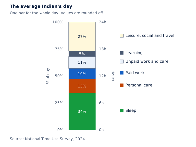
A vertical stacked bar has a percentage scale on the left and an hours scale on the right. Its coloured parts represent sleep, personal care, paid work, unpaid work and care, learning, and leisure, social and travel time. Values are rounded off.
Drawn by One Young India. See Fig. 10.5 in your NCERT textbook
The displayed shares are sleep 34%, personal care 13%, paid work 10%, unpaid work and care 11%, learning 5%, and leisure, social and travel 27%. Here paid work and unpaid work and care distinguish work receiving payment from work or care without payment.
There might be a very small fraction of people whose day is similar or close to this average. The bar represents a broad collection. It does not imply that every person divides time in those proportions.
What does grouping by age add?
What the figure shows
Time use by age group
Four vertical stacked columns represent children aged 6 to 14, youth aged 15 to 24, adults aged 25 to 59, and elderly people aged 60 and above. Colours identify activities; each full column represents a 24-hour day. Values are rounded off.
See Fig. 10.6 in your NCERT textbook
Grouping the collection by age reveals activity differences hidden in the overall average. Learning time in the 15 to 24 age group has reduced significantly compared with the 6 to 14 age group. Further grouping by gender could examine differences within age groups.
This time chart can be read as both an ordinary stacked chart and a 100% stacked chart. Each segment represents an amount of time, and every complete bar represents the same total of 24 hours. Segment lengths therefore also compare relative proportions.
The shared total is crucial. For family expenditure or garden blooms, totals can differ, so equal percentage bars do not imply equal amounts. In the daily-time chart, the equal totals are known independently of the drawing.
Glossary
- Arithmetic mean — The sum of the values in a collection divided by their number.
- Weighted mean — An average obtained by dividing the sum of weighted values by the sum of weights.
- Weight — A number expressing a value's contribution, size or relative importance in a combined average.
- Collection size — The number of individual values represented by the average of a particular collection.
- Concentration — The quantity of a component divided by the quantity of the whole mixture.
- Percentage — A proportion expressed per hundred, allowing comparison of parts relative to their totals.
- Custom weights — Relative weights assigned to different parts according to their importance in an evaluation.
- Run rate — The average number of runs scored per over in the period being considered.
- Cluster-column chart — A chart placing related columns side by side in groups chosen for comparison.
- Stacked bar chart — A chart joining component bars so that complete lengths represent totals and segments represent components.
- 100% stacked bar chart — A chart using equal full lengths for totals and proportional segment lengths for their shares.
- Inference — A conclusion supported by the information available in the data or its representation.
Common errors and misconceptions
- Misconception: Two group averages should simply be added and divided by two. Correct: Use the numbers of values as weights. Equal-sized collections allow their averages to receive equal weight.
- Misconception: A weight must be a physical weight in kilograms. Correct: It can represent a collection size, a liquid quantity or an assigned level of importance.
- Misconception: Mixing 10% and 20% lemonade gives 15% regardless of quantities. Correct: Equal quantities give that midpoint; unequal quantities require their contributions to be weighted.
- Misconception: Assessment marks with different maxima can be weighted directly. Correct: First divide each score by its own maximum, or convert each score to a percentage.
- Misconception: A larger percentage establishes a larger number across different groups. Correct: The number also depends on each group's total, which a percentage chart does not supply.
- Misconception: Equal full bars in a 100% stacked chart mean equal totals. Correct: Each full bar represents its own total as 100%, even when the actual totals differ.
- Misconception: The average daily-time pattern describes everyone's day. Correct: A diverse collection's average often hides differences, and grouping by age can reveal activity-specific patterns.
Exam-style questions with model answers
Q1. Two equal quantities of lemonade contain 10% and 20% jaggery respectively. Find the final jaggery percentage and explain why equal weighting is appropriate. [2 marks]
- The final percentage is (10 + 20) ÷ 2 = 15% jaggery.
- Both concentrations represent equal quantities of lemonade, so their contributions receive equal weight and the final concentration is midway between them.
Q2. Section A has 30 students with an average test score of 72. Section B has 25 students with an average score of 76. Calculate their combined mean, showing how the group totals are used. [3 marks]
- Section A's total score is its average multiplied by its size: 72 × 30 = 2160. Section B's total is similarly 76 × 25 = 1900.
- The combined score is 2160 + 1900 = 4060, representing 30 + 25 = 55 students.
- The combined mean is 4060 ÷ 55 ≈ 73.82. The student counts provide the weights because the two averages represent different-sized groups.
Q3. Rehmat scores 60% in internal tests, 64% in the project and 73% in the final exam. The respective weights are 3 : 2 : 5. Calculate the annual percentage and explain the role of the denominator. [3 marks]
- Multiply each assessment percentage by its matching weight: 60 × 3, 64 × 2 and 73 × 5. Their sum is 673.
- The denominator is 3 + 2 + 5 = 10. It represents the total weight assigned across all assessments, rather than merely the number of assessment categories.
- The weighted annual percentage is 673 ÷ 10 = 67.3%, with the final examination receiving the largest individual weight.
Q4. Three brass batches are combined. Batch A weighs 200 kg and contains 70% copper; Batch B weighs 120 kg and contains 50% copper; Batch C contains 45% copper. The final alloy contains 55% copper. Find Batch C's weight, showing the equation and its solution. [5 marks]
- Let y denote the weight of Batch C in kilograms. The unknown batch contributes both to the total copper and to the total weight of the alloy.
- The copper contributions of A and B are 200 × 0.7 and 120 × 0.5. Together they give 200 kg of copper; Batch C contributes 0.45y.
- The total brass weighs 320 + y kg. Therefore the concentration equation is 0.55 = (200 + 0.45y) ÷ (320 + y).
- Multiplication gives 0.55(320 + y) = 200 + 0.45y. Expanding and collecting terms gives 0.10y = 24.
- Dividing by 0.10 gives y = 240. Thus the required weight of Batch C is 240 kg.
Q5. In 2005, a house's daily electricity consumption in kWh was lighting 360, cooling 300, kitchen appliances 120 and other appliances 220. Calculate each percentage share and explain how to represent these data in a 100% stacked bar. [4 marks]
- The complete daily total is 360 + 300 + 120 + 220 = 1000 kWh. Each component must be compared with this same total.
- Lighting contributes 360 ÷ 1000 × 100 = 36%, and cooling contributes 300 ÷ 1000 × 100 = 30%.
- Kitchen appliances contribute 12%, while other appliances contribute 22%, using the same division by total followed by multiplication by 100.
- Draw one full bar representing 100%, divided into consecutive segments of 36%, 30%, 12% and 22%, labelled by category.
Q6. A 100% stacked chart shows seasonal flower shares. Fatima: summer 50%, monsoon 30%, winter 20%. Naveen: summer 40%, monsoon 35%, winter 25%. Annual totals are not supplied. Explain which comparisons of flower numbers and totals can be established. [4 marks]
- Fatima has more summer blooms than monsoon blooms because 50% exceeds 30% of the same annual total in her garden.
- Her larger summer share does not establish more summer blooms than Naveen: their percentages refer to different, unknown annual totals.
- Similarly, Fatima's smaller winter share does not establish fewer winter blooms than Naveen. The actual numbers depend on both total and share.
- The equal full lengths do not establish equal annual totals. Each bar represents 100% of its own garden's total.
Q7. Values x₁, x₂, …, xₙ have weights w₁, w₂, …, wₙ, with a positive sum of weights. Here n is the number of values, numbered suffixes pair values with weights, and dots indicate continuation. Their weighted mean is (w₁x₁ + … + wₙxₙ) ÷ (w₁ + … + wₙ). Show what happens when every weight is doubled. [3 marks]
- With doubled weights, the numerator becomes 2w₁x₁ + … + 2wₙxₙ, which is twice the original sum of weighted values.
- The denominator becomes 2w₁ + … + 2wₙ, which is also twice the original sum of weights.
- Factor 2 out of both sums and cancel it. The resulting fraction is the original weighted-mean expression, so doubling every weight leaves the mean unchanged.
Q8. Why does an ordinary stacked bar chart help compare totals, and why may comparing its individual components be harder? [2 marks]
- The full length of each stack represents its total, so complete bar lengths can be compared directly.
- Except for the first component, segments do not start at zero and may lack a common base across stacks, which may make component comparisons harder.
Key takeaways
- The arithmetic mean combines a total and a count; combining group means requires keeping track of the sizes they represent.
- A weighted mean divides the sum of value-weight products by the sum of weights, reflecting different contributions or importance.
- Equal-sized collections allow their averages to be averaged directly because the common collection size cancels from the calculation.
- Mixture concentrations depend on how much each mixture contributes, so unequal quantities need unequal weights when concentrations are combined.
- Assessment scores with different maximum marks must first be expressed on a common scale before applying their custom weights.
- Ordinary stacked bars show totals and components together, although comparing components without common starting positions may be harder.
- A 100% stacked bar shows proportions; comparing actual numbers across groups also requires knowing their respective totals.
- An overall average often hides differences within diverse data; grouping people by age can reveal patterns in daily activities.
Test yourself
What extra information accompanies each group mean when calculating a combined mean?
The number of values in each group is needed. It supplies the weight and allows the group's total to be recovered.
Why can averages of equal-sized collections be averaged directly?
Every group average receives the same weight. The common size cancels, leaving the sum of averages divided by the number of groups.
Does the word “weight” necessarily refer to kilograms?
No. A weight can represent a number of observations, a quantity contributed, or relative importance assigned to an assessment.
Which concentration has greater influence when 500 mL of 10% jaggery lemonade is mixed with 200 mL of 20% lemonade?
The 10% concentration has greater influence because it contributes the larger quantity. The final concentration is closer to 10%.
Why divide each assessment score by its own maximum before weighting?
Different maximum marks put raw scores on different scales. Dividing by each maximum expresses performance as comparable fractions.
Can percentage bars alone establish which garden has the larger annual number of flowers?
No. Each complete bar represents 100% of its own annual total, and those totals can differ without changing the displayed proportions.
What information is needed to recover amounts from a 100% stacked bar?
The total represented by each bar is needed, so each percentage can be applied to its corresponding total.
Why can a chart of complete 24-hour days be read as both kinds of stacked chart?
All bars represent the same total of 24 hours. Their segments therefore show amounts of time and proportional shares together.
Write about it
Turn a question from this chapter into a paper.
The Writing Studio has a structure guide, a rubric and citation tools for 15 formats, from essays to research papers. Drafting is free with an account. Learnacy Essential adds feedback from an AI writing coach and submission to The OYI Review.
Learnacy Essential is ₹1,499 for the year. Publication depends on review and is not guaranteed.