
Graphs and Charts for Business Data | CBSE Class 12 Accountancy Notes
On this page
This note covers graphs and charts, the arrangement of business data, chart elements, chart creation in Excel, formatting, pie charts, resizing, two-dimensional and three-dimensional displays, radar and doughnut charts, and the uses of graphical presentation.
What do graphs and charts show about business data?
Definition: A graph is a pictorial representation of data showing a relationship in at least two dimensions. An axis is a line used as a frame of reference for measurement.
Data are the values or information being presented. A variable is a characteristic whose values can differ. A graph can help communicate accounting information when a mass of raw data, meaning data in its original numerical form, may not be easily understandable.
The X-axis is usually horizontal, while the Y-axis is vertical. These names identify the reference directions of the graph. Graphs are usually two-dimensional, meaning that they use two directions; sometimes three-dimensional graphs are also used.
How do the basic forms differ?
A single-line graph displays one line. A multiple-line graph displays several lines; different line types and shades of colour can make them easier to distinguish. A chart is a pictorial presentation of data; Excel uses this term to include graphs.
A pie chart divides a whole into parts to show the relative shares of subgroups of a single variable. A bar diagram depicts two or more variables. Bar charts compare absolute values, meaning the actual amounts, at separate points such as products or time intervals.
An area chart uses a filled area to display values.
What the figure shows
Product-wise total sales
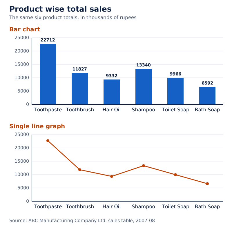
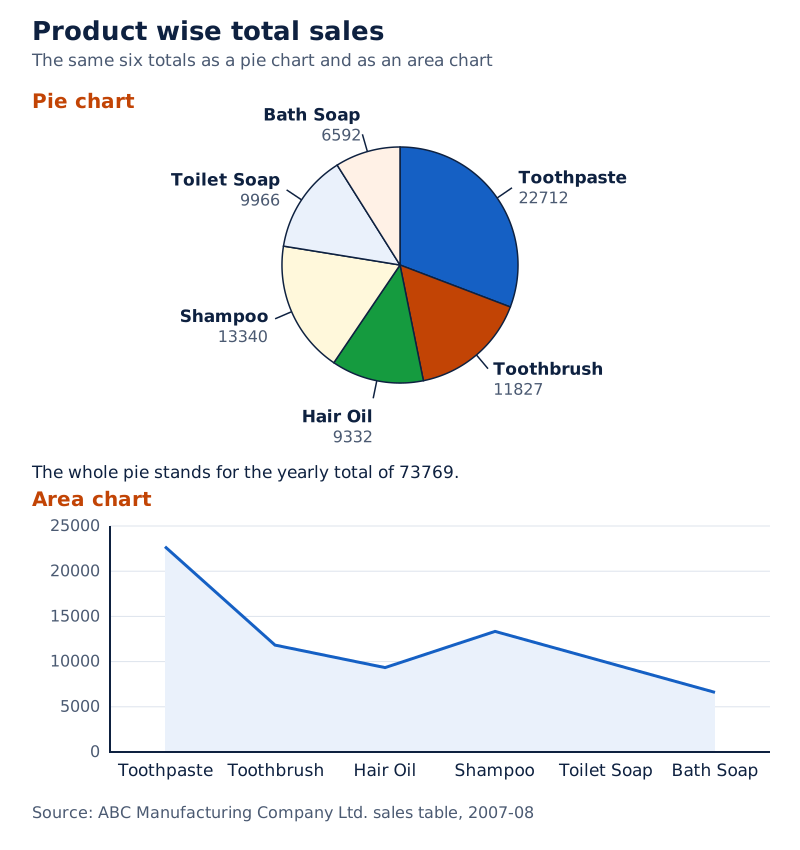
The same product totals appear as a bar chart, a single-line graph, a pie chart and an area chart. Product names label the displays, while the pie uses separately coloured portions.
Drawn by One Young India. See Fig. 4.1 in your NCERT textbook
The different displays show why selecting a chart involves deciding how the reader should see the data, as well as entering the values.
How should quarterly sales data be arranged before drawing a chart?
A worksheet is the row-and-column space in which Excel holds data. A cell is an individual position within it. Enter suitable row and column titles so that values have identifiable products and periods before creating their graphical display.
The following data show sales of ABC Manufacturing Company Ltd. for 2007-08. Qtr1, Qtr2, Qtr3 and Qtr4 mean the first, second, third and fourth quarters of the year. All amounts in this table are in thousands of rupees; Rs means rupees.
| Product | Qtr1 | Qtr2 | Qtr3 | Qtr4 | Total |
|---|---|---|---|---|---|
| Toothpaste | 12344 | 2345 | 3456 | 4567 | 22712 |
| Toothbrush | 3456 | 500 | 2456 | 5415 | 11827 |
| Hair Oil | 3678 | 1345 | 988 | 3321 | 9332 |
| Shampoo | 2900 | 3190 | 3480 | 3770 | 13340 |
| Toilet Soap | 1122 | 2035 | 2948 | 3861 | 9966 |
| Bath Soap | 2344 | 1880 | 1416 | 952 | 6592 |
| Total | 25844 | 11295 | 14744 | 21886 | 73769 |
Which totals answer which question?
The bottom row contains the quarter-wise totals, combining the six products within each quarter. The rightmost column contains the product-wise totals, combining the four quarters for each product. The bottom-right entry is the overall sales total for the year.
In the worksheet layout, row 11 contains the quarterly totals and column G contains the product totals. G11 is the cell reference for the intersection of column G and row 11, which contains 73769.
To compare products, select their names and product-wise totals. To compare periods, reorganise the data into period names and quarter-wise totals. Both charts come from the same sales information, but each displays a different grouping of that information.
Worked example 1. Toothpaste sales are 12344, 2345, 3456 and 4567 thousand rupees for Qtr1 to Qtr4 respectively. Find the product total used in the product-wise chart.
Answer: Add the four quarterly values: 12344 + 2345 + 3456 + 4567 = 22712 thousand rupees. Here + means addition and = means equality. Plot Toothpaste against 22712 in the product-wise total-sales display.
Keeping labels and values together is central to chart preparation. A number without its product or quarter cannot communicate the intended comparison. The chart therefore draws on the arrangement of the worksheet as well as on its numerical entries.
How can a basic chart be created and its type selected in Excel?
The procedure uses Microsoft Excel 2007, a spreadsheet program. A workbook is the Excel file containing worksheets. The Ribbon is the command area at the top of its window, organised into tabs and groups of tools.
- Click the computer's Start icon and use Programs to reach the installed programs.
- Select MS Excel 2007 to open a blank workbook with the Ribbon at the top.
- Enter the data in the worksheet with appropriate row and column titles.
- Select the data required for the chart, such as product names and their total sales.
- Open the Insert tab and choose the required chart type from the Charts group.
The two essential stages are therefore entering the data and selecting a chart type for the chosen data. Reorganising the selected information allows another chart to show a different aspect, such as total sales for each quarter.
What choices does the Charts group provide?
A column chart uses columns to represent values. A chart type is a basic form of display, such as a column or pie chart. A subtype is a version within that form, such as a stacked column or a three-dimensional pie. A stacked column combines components within a column.
Column charts are useful both for showing changes over a period of time and for comparing items. A chart can also combine more than one chart type after its elements and formatting are understood.
| Purpose | Data to select | Display to consider |
|---|---|---|
| Compare product totals | Product names and total sales | Bar chart |
| Show quarterly sales | Quarter names and quarterly totals | Column chart |
| Show each quarter's share of the whole | Quarter names and quarterly totals | Pie chart |
Changing the chart type provides another visualisation of the same data. A column or bar chart can become a pie chart when the data suit that display. The choice should serve the purpose of the presentation and the nature of the data.
What are the main elements of a chart?
The chart area is the entire chart, including all its elements. The plot area is the region bounded by the axes: two axes in a two-dimensional chart and three axes in a three-dimensional chart.
2-D means two-dimensional and 3-D means three-dimensional. In a 3-D chart, the third direction is the Z-axis, also called the depth or series axis. The plot area is therefore only one part of the larger chart area.
How do data points, markers and series connect?
A data point is an individual value plotted in the chart. A data marker is the bar, column, line, pie portion or other shape representing a plotted value. Related data points together form a data series.
A series is distinguished by a unique colour, pattern or both. Markers of the same colour can constitute one series. A chart may contain more than one series, allowing related groups of values to be displayed together.
The category axis usually contains the independent values or categories, meaning the known groups used to organise the display. The value axis usually contains dependent or derived values, meaning the data plotted against those groups.
| Element | Meaning | Quarterly-sales example |
|---|---|---|
| Chart title | Descriptive text naming the chart | Quarterly Sales |
| Axis titles | Descriptive text identifying the axes | Period and Sales |
| Legend | Identifier for a series or category | Total Sales |
| Data label | Additional information identifying a marker's value or details | 25844 above the first quarter's marker |
A legend tells the reader which information a colour or pattern represents. A data label provides details about a particular data point. Gridlines are the reference lines crossing the plot area, visible behind the markers.
What the figure shows
Quarterly sales and chart elements
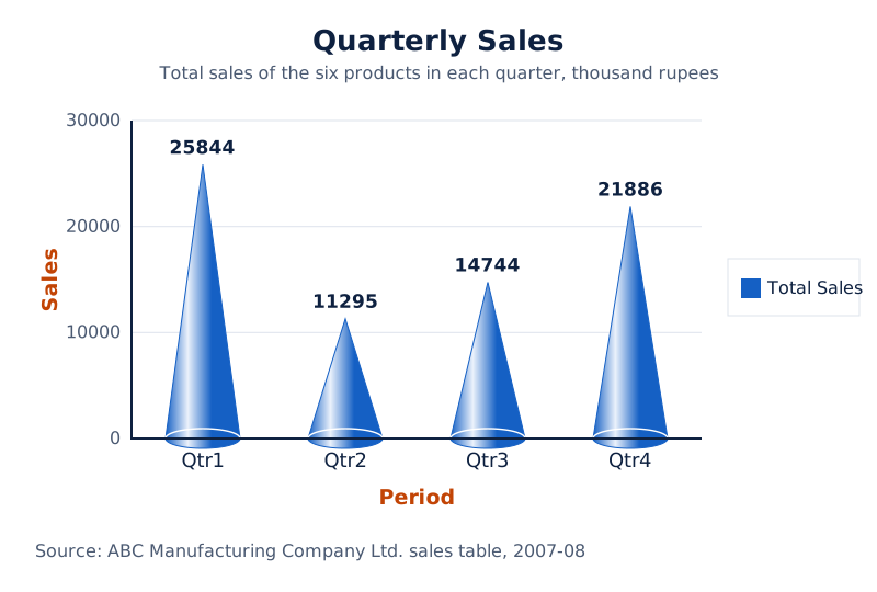
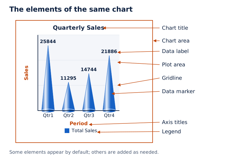
Four blue cone-shaped markers represent the quarters. Their labels are 25844, 11295, 14744 and 21886. The chart title is above the plot, axis titles identify Sales and Period, and Total Sales appears in the legend.
Drawn by One Young India. See Figs. 4.5 and 4.6 in your NCERT textbook
Some elements appear by default when a chart is prepared, while others can be added as needed. Their display and format can be changed. Understanding each element makes it possible to select the specific part that needs editing.
How do Design and Format change a chart?
Clicking anywhere in a chart displays Chart Tools, the contextual tools for editing that chart. These include the Design, Layout and Format tabs. Design provides options for changing the chart type, layout and style.
A chart layout concerns the arrangement of chart elements, while a chart style supplies a chosen appearance. These options allow the same selected data to be presented in different ways without entering the sales table again.
What does Switch Row/Column do?
Switch Row/Column interchanges the use of row and column data in a 2-D chart. In the sales illustration, the horizontal categories change from products to quarters, and the products become the series identified in the legend.
- Click the chart to display Chart Tools.
- Open the Design tab.
- In its Data group, choose Switch Row/Column.
- Read the changed chart using its quarter categories and product legend.
What the figure shows
Switching the sales chart
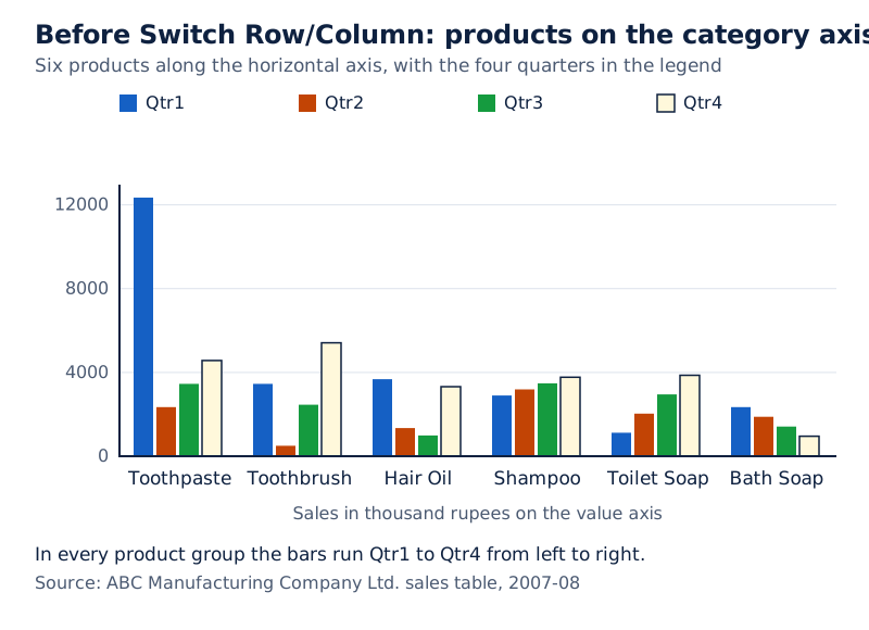
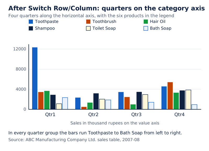
The first chart places six products along the horizontal axis and lists the four quarters in its legend. The switched chart places four quarters along that axis and lists the six products in its legend.
Drawn by One Young India. See Figs. 4.7 and 4.8(b) in your NCERT textbook
How is a particular element selected for formatting?
Click the required element directly, or use the Current Selection group on the Format tab. Its Chart Elements box lists elements that can be selected. This is useful when changing a particular part rather than the whole chart's appearance.
- Click anywhere in the chart to display Chart Tools.
- On Format, open the arrow beside the Chart Elements box in Current Selection.
- Select the required chart element and click Format Selection.
- In the element's formatting dialog box, choose a category and its formatting options.
A dialog box is the window containing these choices. The selected element determines which options are relevant. The operation begins with identifying that element, then applying the desired format to it.
How can fills, outlines, effects and text be formatted?
The Shape Styles group on Format controls the appearance of selected chart shapes. A fill is the colour or other treatment inside a shape. An outline is its boundary or line. Select the element before changing these properties.
Which fill and outline options are available?
Use the More button to see the available predefined shape styles. Choose Shape Fill for another fill. Theme Colours and Standard Colours provide choices, while More Fill Colours opens additional Standard or Custom choices.
Custom colours become available under Recent Colours for reuse. No Fill removes the selected element's fill colour. Picture inserts a chosen picture, Gradient provides a graduated colour effect, and Texture applies a patterned surface treatment.
| Control | Purpose |
|---|---|
| Shape Outline | Choose a different outline colour |
| No Outline | Remove the outline colour |
| Weight | Change the thickness of a line or border |
| Dashes | Choose a broken-line pattern |
| Arrows | Add a chosen arrow style to a line |
More Outline Colours supplies additional colour choices. More Lines supplies further line and border settings. Arrows apply to lines, not borders. If the selected element is a line, using No Outline makes that line no longer visible on the chart.
What can effects and text formatting change?
Shape Effects supplies effects such as reflection and bevel. Reflection gives a reflected appearance; bevel gives an edge treatment. Available effects depend on the selected chart element, and shape effects are not available for all chart elements.
For ordinary text formatting, select the element containing the text. Right-click or select the text and use the Mini toolbar, a compact set of formatting commands. Alternatively, use the formatting buttons in the Font group on Home.
WordArt provides styled text formatting. Select the element containing the text, then use WordArt Styles on Format. Its More button reveals the available styles. Text options include Text Fill, Text Outline, Shadow, 3-D Format, 3-D Rotation and Text Box.
Text Fill changes the inside of letters, while Text Outline changes their boundaries. Shadow adds a shadow effect; rotation changes orientation. These are text-related choices, distinct from selecting the numerical data used in the chart.
The Layout tab also allows the insertion of pictures, clip art, data labels and grids. Clip art means ready-made illustrations. Labels and titles can therefore be managed alongside the graphical elements needed to explain the display.
How does a pie chart present quarterly sales?
A pie chart shows parts of a whole. Each slice represents a category's proportional share, meaning its size relative to the total. The whole pie represents 100%, where % means per cent, or parts out of one hundred.
The quarterly-sales example uses one data series whose plotted values are positive and non-zero. The category labels identify the quarters. A single series of quarter totals can therefore be displayed as slices instead of the markers in a column chart.
| Period | Total sales, thousand rupees |
|---|---|
| Qtr1 | 25844 |
| Qtr2 | 11295 |
| Qtr3 | 14744 |
| Qtr4 | 21886 |
| Total | 73769 |
Worked example 2. Quarterly sales are 25844, 11295, 14744 and 21886 thousand rupees, with annual sales of 73769 thousand rupees. Identify the largest and smallest quarter totals for a pie-chart comparison.
Answer: Qtr1 has the largest total, 25844, and Qtr2 has the smallest, 11295. Their corresponding slices represent the largest and smallest shares of the same annual total. Use the four quarter values as the parts of the pie.
What are the creation and finishing steps?
- Enter the data and select the labels and values from two consecutive columns.
- Select Pie on the Ribbon, then select the 3-D Pie subtype.
- Click the plot area to display Chart Tools. On Design, select the required Chart Layout and Chart Style.
- On Format, open Shape Effects, choose Bevel and then 3-D Options. Set the Top and Bottom bevel choices and their Width and Height.
- Under Surface, choose Material, which controls the surface appearance, and close the dialog box.
- Use Shape Effects and Shadow to select an Outer, Inner or Perspective shadow.
- For rotation, select the plot area and open Format Selection in Current Selection.
- Use Angle of first slice, the setting that positions the initial slice. Move its slider or enter a value from 0 to 360 degrees, then close the dialog box.
A degree is the unit used here for an angle of rotation. Further finishing can include selecting the chart area and applying a bevel to it. Different workbook theme colours are selected through Page Layout, Themes and a Built-in theme.
Note: The pie-chart procedure uses only one data series and positive, non-zero values. Use no more than seven categories for this procedure. Pie and doughnut charts do not have axes; their parts are read through the slices or rings and their identifying labels or legend.
A pie chart can therefore communicate the relative importance of each quarter while retaining the same underlying figures. Its purpose differs from an axis-based display of absolute sales values, even though both use the quarterly totals.
How can a chart be resized and its presentation completed?
Resizing means changing a chart's size to suit the required presentation. Select the chart first. The position of the mouse pointer then determines whether the chart's boundary can be dragged to a different size.
- Click the chart with the left mouse button to select it.
- Move the pointer to a corner or the middle of a border.
- Watch for the pointer to become a two-headed arrow.
- Hold the left mouse button and drag or pull the boundary to resize the chart.
The size of text and individual elements, including titles and legends, can also be adjusted. Selecting the correct element is therefore necessary when the intention is to change its appearance rather than simply enlarge or reduce the chart boundary.
What should the final sequence include?
After entering data and creating a basic chart, change its layout or style as required. Then attend to the titles and data labels. These may be added or removed, and a title may be linked to a worksheet cell.
Next decide whether to show or hide the legend. The chart's axes and gridlines can also be displayed or hidden. Primary axes are the main axes; secondary axes are an additional set used in the chart.
Complete the process by moving or resizing the chart and saving it. This sequence brings together data selection, chart creation and presentation. A finished chart includes the identification and display choices needed to communicate its data.
How do two-dimensional and three-dimensional charts use axes?
A 2-D chart typically uses a horizontal category axis and a vertical value axis. The known or independent value goes on the X-axis, while the derived or dependent value goes on the Y-axis.
For a display of monthly demand for products in rupees, Month belongs on the horizontal axis and the demand values belong on the vertical axis. Categories provide the frame for reading the measured or derived values.
Where do positive and negative values appear?
The origin, represented by O, is the point where the X-axis and Y-axis intersect. Positive X values lie to its right and negative X values to its left. Positive Y values lie above it and negative Y values below it.
For monthly profit and loss, profit is represented by positive values and loss by negative values. A graph can therefore include values on opposite sides of an axis instead of displaying every value above the origin.
What the figure shows
Axes and the origin
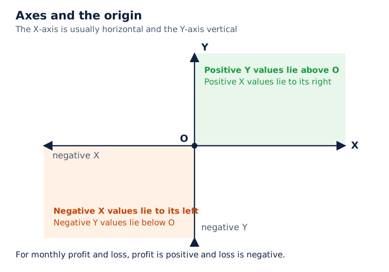
Horizontal and vertical lines cross at O. X and Y identify the rightward and upward directions; negative X and negative Y identify the leftward and downward directions.
Drawn by One Young India. See Fig. 4.10 in your NCERT textbook
What does the third dimension add?
A 3-D chart adds the depth axis, also called the series axis or Z-axis, allowing data to be plotted along the depth of the chart. To represent volume, three parameters are needed: height, length and breadth.
| Axis | Direction or role | Volume example |
|---|---|---|
| X-axis | Horizontal or category axis | Length |
| Y-axis | Vertical or derived-value axis | Height |
| Z-axis | Depth or series axis | Breadth |
Do not apply the two-axis description to every chart form. Radar charts lack a horizontal category axis, while pie and doughnut charts have no axes. The statement that 2-D charts typically have two axes must retain that qualification.
How do radar and doughnut charts compare data?
A radar chart compares the aggregate values of several data series. Aggregate values are values considered together for comparison. Data arranged in worksheet columns or rows can be plotted in this form; it does not have a horizontal category axis.
The sales comparison uses Lowest and Highest as two series. Each series contains values for the same six products. Their identification makes it possible to compare the two sets while keeping each product's position in the display clear.
| Product | Lowest | Highest |
|---|---|---|
| Toothpaste | 2345 | 12344 |
| Toothbrush | 500 | 5415 |
| Hair Oil | 988 | 3678 |
| Shampoo | 2900 | 3770 |
| Toilet Soap | 1122 | 3861 |
| Bath Soap | 952 | 2344 |
| Total | 8807 | 31412 |
Worked example 3. For Toothbrush, the lowest sales value is 500 and the highest is 5415. Identify how these entries belong in a radar comparison containing the series Lowest and Highest.
Answer: Plot 500 as the Toothbrush point in the Lowest series and 5415 as its point in the Highest series. The legend identifies the two series, allowing their values for the same product to be distinguished.
What the figure shows
Lowest and highest sales
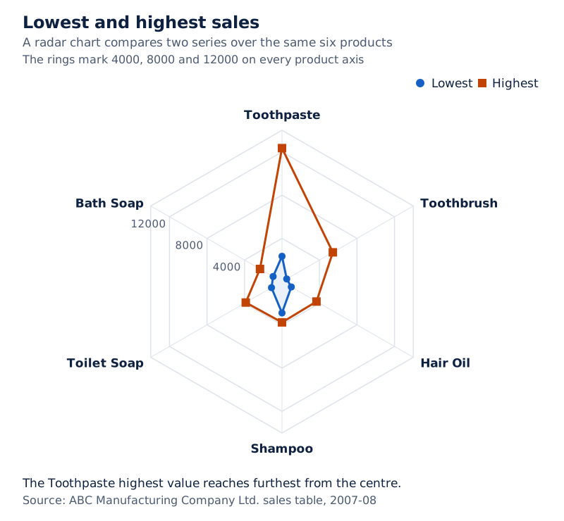
Six product labels surround a web-shaped grid. The legend distinguishes the blue Lowest series from the red Highest series, with the Toothpaste high value extending furthest from the centre.
Drawn by One Young India. See Fig. 4.12 in your NCERT textbook
How does a doughnut chart differ from a pie chart?
A doughnut chart also shows relationships between parts and a whole, but it can contain more than one data series. It displays data in rings, with each ring representing a series. Its data can be arranged in worksheet rows or columns.
An exploded doughnut separates portions to emphasise individual values while showing their contributions to a total. Like the ordinary doughnut form, it can contain more than one series. A pie chart, by comparison, has only one data series.
What the figure shows
Sales comparison in rings
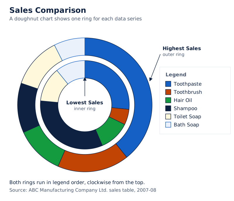
The display has two coloured rings, a central opening and a legend listing six products. The title reads Sales Comparison, and a label points to Lowest Sales.
Drawn by One Young India. See Fig. 4.13 in your NCERT textbook
Doughnut charts are not easy to read. A stacked column or stacked bar chart may be used instead. The ability to include several series does not remove the need to select a presentation that readers can understand.
What advantages do graphs and charts offer for communication?
Graphs and charts help users see trends and compare values. A trend is a pattern of change visible in the data. Graphical presentation can make such patterns easier to comprehend than a long textual explanation of individual figures.
How do charts help users explore, present and convince?
Help to explore: A chart may make it quicker and easier to see a possible relationship between variables than searching through raw data. The purpose is to explore the possible relationship, retaining the distinction between a visual comparison and a definite conclusion.
Help to present: A graph can communicate information in a short time. It can sum up ideas visually, making a large body of numerical information more accessible to a reader who needs to understand its main features.
Help to convince: Graphs can turn large amounts of information into displays that are easily used to persuade. The same visual features that assist exploration and presentation can therefore also support communication intended to convince an audience.
How can a sales chart support a clear description?
Worked example 4. A quarterly-sales chart displays Qtr1: 25844, Qtr2: 11295, Qtr3: 14744 and Qtr4: 21886, all in thousands of rupees. Describe the sequence of change shown by the four values.
Answer: Sales fall from Qtr1 to Qtr2, then rise in Qtr3 and again in Qtr4. Qtr4 remains below Qtr1. The graph makes this sequence visible while its data labels retain the exact quarterly amounts.
Highly random data, such as stock prices, meaning the prices of shares, may be difficult to explain through text alone. Graphs and charts can make fluctuations easier to comprehend. A fluctuation is an upward or downward change in a value.
Effective chart preparation therefore links the data, the display and its explanation. Enter and label the values, select the appropriate chart, adjust the elements needed for understanding, and save the finished presentation. These tasks work together to communicate the accounting information.
Glossary
- Graph — A pictorial representation of data showing a relationship in at least two dimensions.
- Chart area — The entire chart, including the plot area and all its other displayed elements.
- Plot area — The region bounded by two axes in a two-dimensional chart or three in a three-dimensional chart.
- Data point — An individual value plotted as part of a chart's displayed information.
- Data marker — A bar, column, line, pie portion or other shape representing a plotted value.
- Data series — Related data points plotted together and identified through a unique colour, pattern or both.
- Legend — An identifier showing which data series or category a chart's visual treatment represents.
- Data label — Additional information attached to a data marker to identify details of its data point.
- Category axis — The usually horizontal axis containing the independent values or categories used in the chart.
- Value axis — The usually vertical axis containing the dependent or derived data values being displayed.
- Origin — The point at which the horizontal and vertical axes of a graph intersect.
- Depth axis — The third axis of a three-dimensional chart, also called the series axis or Z-axis.
- Pie chart — A display of subgroups of one variable as proportional parts of a whole.
- Radar chart — A chart comparing aggregate values of several data series without a horizontal category axis.
- Doughnut chart — A chart showing parts of a whole in rings, each representing a data series.
Common errors and misconceptions
- Misconception: The chart area and plot area are the same region. Correct: The chart area includes all chart elements. The plot area is the region bounded by the axes in an axis-based chart.
- Misconception: A legend supplies the exact value of every point. Correct: A legend identifies series or categories. A data label supplies additional details about a particular data point.
- Misconception: Every chart has horizontal and vertical axes. Correct: Two-dimensional charts typically have these axes, but radar charts lack a horizontal category axis, and pie and doughnut charts have no axes.
- Misconception: Switching rows and columns simply changes colours. Correct: Switch Row/Column changes how row and column data are plotted. The sales example changes from product categories to quarter categories.
- Misconception: Every sales number in the main worksheet is expressed in single rupees. Correct: Its amounts are in thousands of rupees. Preserve that unit when interpreting totals or writing answers.
- Misconception: A pie chart and a doughnut chart both use only one data series. Correct: A pie uses one series; a doughnut can use more than one, with a separate ring for each.
- Misconception: Shape effects work for every element and No Outline leaves a line visible. Correct: Effects depend on the selected element. No Outline makes a selected line no longer visible on the chart.
Exam-style questions with model answers
Q1. Distinguish between the chart area and plot area of a two-dimensional chart. [2 marks]
- The chart area is the entire chart, including all its displayed elements.
- The plot area is the region bounded by the horizontal and vertical axes within that chart.
Q2. Explain data series, legend and data label as three chart elements. [3 marks]
- A data series consists of related data points plotted together. Each series is shown using a unique colour, pattern or both.
- A legend identifies the series or categories represented in the chart, allowing the reader to distinguish the information shown by different visual treatments.
- A data label gives additional information about a data marker, identifying the details of an individual data point within its series.
Q3. Toothpaste sales for Qtr1, Qtr2, Qtr3 and Qtr4 are respectively 12344, 2345, 3456 and 4567 thousand rupees. Calculate the annual product total and state the product name and value to select for its total-sales chart. [2 marks]
- The annual product total is 12344 + 2345 + 3456 + 4567 = 22712 thousand rupees.
- Select the product name Toothpaste together with its total-sales value of 22712, keeping the unit as thousands of rupees.
Q4. A quarterly-sales chart shows Qtr1: 25844, Qtr2: 11295, Qtr3: 14744 and Qtr4: 21886, all in thousands of rupees. Give four observations: the largest quarter, the smallest quarter, the direction of successive changes, and Qtr4 compared with Qtr1. [4 marks]
- Qtr1 has the largest sales total among the four quarters, with sales of 25844 thousand rupees.
- Qtr2 has the smallest total, with sales of 11295 thousand rupees, below the other three quarter totals.
- The sequence falls from Qtr1 to Qtr2, then rises from Qtr2 to Qtr3 and again from Qtr3 to Qtr4.
- Qtr4 reaches 21886 thousand rupees. Although it follows two successive increases, its sales remain below the Qtr1 total of 25844 thousand rupees.
Q5. In Excel 2007, explain six stages for creating and beginning to format a 3-D pie chart from these sales data: Qtr1 25844, Qtr2 11295, Qtr3 14744 and Qtr4 21886, in thousands of rupees. Cover entry, selection, chart choice, layout, style and bevel settings. [6 marks]
- Enter the quarter names and their sales in a worksheet, with one column for categories and the next for values. Retain the unit of thousands of rupees.
- Select the two consecutive columns containing those four quarter names and their four values. They provide the categories and the single sales series.
- Choose Pie from the Ribbon, then select the 3-D Pie subtype to create the graphical display of the four quarter values.
- Click the plot area to display Chart Tools. On the Design tab, use Chart Layouts to choose the required layout.
- On the Design tab, use Chart Styles to select the required style for the pie chart's presentation.
- On Format, choose Shape Effects, Bevel and 3-D Options. Select Top and Bottom bevel settings and enter their Width and Height before choosing the surface material.
Q6. Explain how to select a chart element through Current Selection and open its formatting options in Excel 2007. [4 marks]
- Click anywhere in the chart so that Chart Tools appears with the Design, Layout and Format tabs available.
- Open Format and locate the Current Selection group. Click the arrow beside the Chart Elements box to display the available elements.
- Choose the element that needs changing from this list, and click Format Selection in the same group.
- In the formatting dialog box for that element, select the appropriate category and then choose the formatting options required.
Q7. Explain three advantages of graphs and charts for communicating information. [3 marks]
- They help users explore data: a chart may make it quicker and easier to see possible relationships between variables than searching through raw figures.
- They help users present information: graphical displays can sum up ideas and communicate numerical information in a short time.
- They help users convince an audience: large amounts of information can be turned into visual displays that are easily used to persuade.
Q8. In a radar comparison, Toothbrush has Lowest 500 and Highest 5415; Shampoo has Lowest 2900 and Highest 3770. Name the two series and assign the two values of each product to them. [3 marks]
- The two data series are Lowest and Highest. Each groups the corresponding sales values for the products in the comparison and is identified by the legend.
- For Toothbrush, plot 500 in the Lowest series and 5415 in the Highest series, keeping both associated with the Toothbrush category.
- For Shampoo, plot 2900 in the Lowest series and 3770 in the Highest series, keeping both associated with the Shampoo category.
Key takeaways
- Graphs and charts present numerical information visually, helping readers compare values and recognise patterns that may be harder to understand from raw data.
- Arrange worksheet data with meaningful row and column titles, then select the labels and values required for the intended comparison.
- Distinguish the entire chart area from the plot area, and distinguish series identifiers in the legend from details attached to data markers.
- Use Design, Layout and Format to change the chart's presentation, beginning by selecting the chart or the particular element requiring attention.
- A pie chart presents one series as parts of a whole, while a doughnut can display several series in separate rings.
- Two-dimensional charts typically use category and value axes; three-dimensional charts add depth, while pie and doughnut charts have no axes.
- Retain the worksheet's units when interpreting values, and select product totals or quarterly totals according to the purpose of the chart.
- Graphs help users explore possible relationships, present information quickly and persuade through visual displays of large amounts of information.
Test yourself
What is the distinction between a data point and a data series?
A data point is an individual plotted value. A data series consists of related data points plotted together and identified by colour, pattern or both.
Which three tabs appear when clicking a chart displays Chart Tools?
The Design, Layout and Format tabs appear, providing tools for changing the chart and its elements.
What changes when the illustrated product-wise quarterly chart uses Switch Row/Column?
The horizontal categories change from products to quarters, while the products become the series identified in the legend.
How is a selected chart resized with the mouse?
Move the pointer to a corner or border until it becomes a two-headed arrow. Hold the left mouse button and drag to change the size.
What does the complete pie represent, and how many series does a pie chart use?
The complete pie represents the whole, or 100 per cent. A pie chart uses only one data series.
Where do negative values lie relative to the origin on the X-axis and Y-axis?
Negative X values lie to the left of the origin. Negative Y values lie below the origin.
What is the depth axis also called, and what does it allow?
It is also called the series axis or Z-axis. It allows data to be plotted along the depth of a three-dimensional chart.
Why might a stacked column or stacked bar chart be used instead of a doughnut chart?
Doughnut charts are not easy to read, so a stacked column or stacked bar chart may be used instead.
Write about it
Turn a question from this chapter into a paper.
The Writing Studio has a structure guide, a rubric and citation tools for 15 formats, from essays to research papers. Drafting is free with an account. Learnacy Essential adds feedback from an AI writing coach and submission to The OYI Review.
Learnacy Essential is ₹1,499 for the year. Publication depends on review and is not guaranteed.